Fundamentals of graphic design—essential tools for effective visual science communication
Abstract
Guidance on improving the visual aspects of science communication range from “recipe”-style instructions to hyper-focused aspects of data visualization. Currently lacking in the peer-reviewed literature is a primer in graphic design tailored to a high-level overview of basic design principles and associated jargon related to layout, imagery, typeface, and colour. We illustrate why these aspects are important to effective communication. Further, we provide considerations on when to solicit professional assistance and what to expect when working with graphic designers. Having the fundamental principles of good design in your toolbox facilitates the production of effective visual communication related to your research and fruitful scientist–designer collaborations.
Science communication and the visual design gap
The value of science communication has been well established (see Treise and Weigold 2002; Bickford et al. 2012; Rull 2014; Makri 2017); thus, having tools to increase the effectiveness of these efforts is imperative (Cooke et al. 2017; Illingworth 2017). Best practices in the field of science communication come from a comprehensive body of knowledge from a wide range of disciplines (Guenther and Joubert 2017). Within the peer-reviewed literature, guidance on improving and assessing effectiveness of written and oral presentation skills has dominated (see Baram-Tsabari and Lewenstein 2013; Kueffer and Larson 2014; Cirino et al. 2017; Rakedzon et al. 2017). Less emphasis, however, has been placed on improving the visual aspects of science communication. Visuals may accompany an oral presentation or may be standalone, and encompass both print (e.g., posters, reports, newsletters) and digital media (e.g., slides, websites, blogs).
Rodriguez Estrada and Davis (2015) identified that visual materials have typically been treated as an add-on instead of being an integrated aspect of science communication. While peer-to-peer communications have long employed graphs and figures for journal publications and conference posters, it used to be standard practice for academic and research institutions to hire experts to assist with graphics (Frankel and DePace 2012). With a more recent need to connect with nonspecialist audiences in addition to continuing to communicate with peers, more publications have been surfacing with guidance on improving various facets of visual communications, drawing specifically on incorporating graphic design principles. Many of these publications, however, are either limited in scope (e.g., Rodriguez Estrada and Davis (2015) provided an excellent call to action but have no visuals; though it is a commentary), are aimed at one specific type of visual medium such as a poster presentation (e.g., Pedwell et al. 2017), or are hyper-focused into one specialized component such as producing imagery via understanding concepts in data visualization (e.g., Tufte 1997; Frankel and DePace 2012; McInerny et al. 2014; Grainger et al. 2016; Ynnerman et al. 2018). What is lacking is a primer in graphic design aimed to facilitate an understanding in fundamental aspects such that users are well-enough versed in the terminology and concepts to further explore resources, as well as open the door to fruitful scientist–graphic designer collaborations.
Support for visual communication
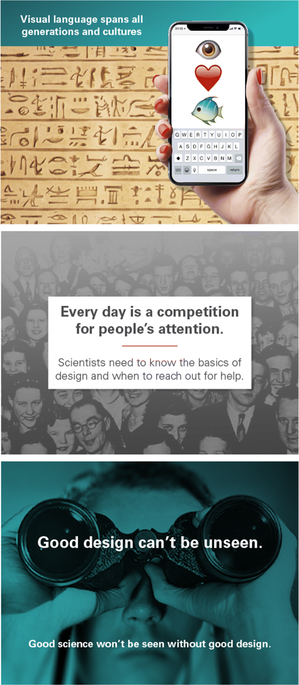
The visual language spans all ages, cultures, and experience levels, and is arguably the most effective form of science communication (Ynnerman et al. 2018). Using visual language as a means for communication has been an important tool throughout human history (Ozdamli and Ozdal 2018), but it has a particularly prominent part in our cultural identity in the 21st century (Rodriguez Estrada and Davis 2015). Communication materials with visuals grab our attention and maintain our motivation to be engaged (Cook 2006), and they tend to have higher citation counts among peer-reviewed literature (Lee et al. 2018). That said, if visuals are not used correctly, they will not be effective (Maddalena and O’Reilly 2018). As a result, the goal of communicating science, whether to share knowledge and (or) drive behavior or policy changes (Cooke et al. 2017) may not be achieved to the same level, or at all.
The role of graphic design is communication (Barnard 2005); thus, it should be intuitive to seek knowledge from professionals in the field. As such, we use the lens of a graphic designer to illustrate some fundamentals of good design and explain how these choices relate to effective communication, whether to peers or nonspecialists in your field. Recognizing that it isn’t possible to cover all topics, nor make someone an expert in graphic design, we stick to key elements that, as a basis, will add to the tools in your communications toolbox. Knowing when to reach out for graphic design assistance, and what to expect when working with a designer are also covered.
A primer in graphic design
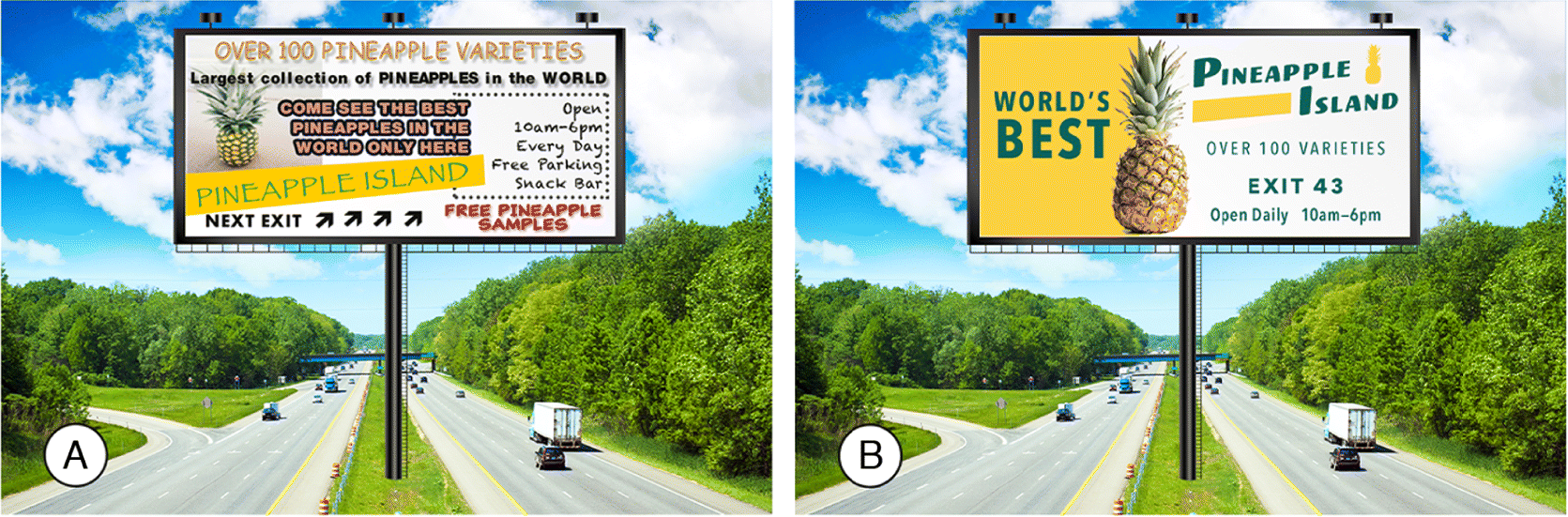
Graphic design is part of the visual culture of everyday life; in the products we use to the formatting of the information we consume (Barnard 2005). Every day is a competition for people’s attention in a sea of information; thus, science communication efforts need to be effective. Using the analogy of a billboard alongside a highway, the opportunity to capture attention and transmit desired information at a fast pace, can be affected by presentation layout, imagery, typeface, and colour choice (Fig. 1). Each of these design components are considered below, with a common thread of knowing your audience as a key component to producing effective communication.
Fig. 1.
Layout
Regardless of the type of visual communication desired (e.g., poster, slides, flyer, blog, etc.), the foundation of the presentation is the layout. The arrangement of information can influence how the reader navigates the material. Cluttered layouts are difficult to navigate compared with layouts that provide breathing room (i.e., white space) to text and images (see Figs. 1 and 2). Well laid-out information requires less cognitive load to process, leaving more brainpower for learning (see Cook 2006).
Fig. 2.
Lidwell et al. (2010) provided great design advice to enhance presentation layout, maximizing usability and memorability of the information. The signal to noise ratio is a useful concept to determine the amount of information to present where clearly communicating information (high signal) with minimal degradation due to excess material (low noise) is the goal. When in doubt, chose simplicity over complexity, by taking away everything you can in a visual (including text) until you have only the essentials there.
Our minds are sensitive to picking up differences in alignment of text and imagery (Leborg 2006); thus, it is suggested to keep elements of the presentation aligned to a grid (Lupton and Phillips 2008). To facilitate comparisons, organize the information such that the data are side-by-side (e.g., Fig. 1). Using a strategy of breaking up information into digestible chunks, and arranging related information together, also minimizes fatigue in processing the message (Lidwell et al. 2010). Creating a hierarchy in the organization of the information by using different fonts and (or) colour provides meaningful order that assists the user in navigation. The audience is looking for the path of least resistance to get through the material, so a successful layout will allow for multiple entry points where data can be easily digested (Saltz 2009).
Gestalt psychology is often referenced when discussing visual presentation layout (see Tversky 2011 for a more detailed explanation). A simplified explanation of Gestalt psychology is that individual elements in a visual presentation (i.e., imagery, text) are not viewed in isolation, but are viewed together as a whole picture. Thus, how objects are arranged in terms of proximity, symmetry, and similarity can affect the user experience of the design (Leborg 2006). Moore and Fitz (1993) demonstrated how applying Gestalt principles can improve the design of instructional materials on disassembling a light switch and clearly illustrate how good design changes the usability and, thus, effectiveness of the presentation.
In short, when creating a visual presentation, utilize the billboard analogy employed above, and determine if the layout has done enough to capture and engage the desired audience. Be aware, scientific peers will likely be more willing to wade through a less optimal layout to retrieve data compared with nonspecialists in the field. That said, less effort to navigate through information is a win for everyone.
Imagery
For the purpose of this paper, we are using the broad term of imagery to encompass photographs, graphs, maps, sketches, schematics, infographics, and icons that scientists use to complement text in presentations of all forms. Imagery has a long history in the communication of research findings (Rigutto 2017) and is the key to attracting attention and maintaining motivation for engagement (Cook 2006). While the saying “a picture is worth a thousand words” can be explained by the picture superiority effect (Pavio et al. 1968), a picture and appropriate text are superior to memory than words or pictures alone (see Mayer and Gallini 1990). Figure 2 employs combinations of images and text to enhance the transmission of the message to the audience.
The increased sophistication of software packages for data visualization and map making has evolved our ability to create images. Layering data in images can be a very effective method of communicating information as complex relationships and data comparisons can be more easily conveyed in an image than text (Lupton and Phillips 2008; Lidwell et al. 2010). Despite increased abilities to visualize data, Kelleher and Wagener (2011) caution that the use of “impressive” looking images over “sensible” plots can detract from the effectiveness of the image as a communication tool.
Frankel and DePace (2012) offered sound guidance on image production and data visualization. First, the characteristics of the audience need to be determined. Second, determine how the image will be used (i.e., for an oral presentation that may be seen for seconds or in a poster where there is no time limit for viewing). Lastly, determine the goal of the image—specifically, what message is the image to convey. Just as word choice for a presentation is tailored to fit the audience, the same considerations should be applied to the production of imagery. For example, Rickard et al. (2017) determined that when communicating storm surge risk related to hurricanes, a photograph depicting a house with storm surge damage was more effective when compared with a storm surge inundation map. Further, images that would be effective in communicating results in a scientific journal where the user has time to digest axes labels, symbol meanings, etc., may not be as effective in a slide presentation where the audience has limited viewing time. Determining the goal of the image (e.g., compare and contrast, illustrate a process, explain a concept), will also help shape what type of figure should be utilized and how it can be most effective (Frankel and DePace 2012).
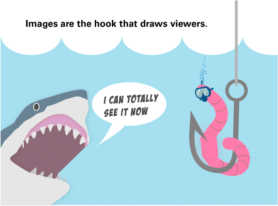
Regardless of the image type, some basic guidelines include using high-quality images that are sharp, clear, and distinct (Fig. 3). Images should also be authentic and related to the science being communicated; clip art and stock images should be avoided. Because clip art and stock images can be outdated and over-used, we suggest generating using your own photographs, sketches, storyboards, or comics. Comics and storyboards are not only authentic to your own work, but also infuse a storytelling appeal that is effective over broad audiences (Lupton 2017; Farinella 2018). For example, Fig. 4 utilizes a comic to emphasize how compelling imagery can be a hook to gain audience engagement. Storyboards that convey a sequence of events through a series of images in a sequence can be used to illustrate scientific methods or to emphasize a finding. Opportunities abound for further research into the effectiveness of images in science communication.
Fig. 3.
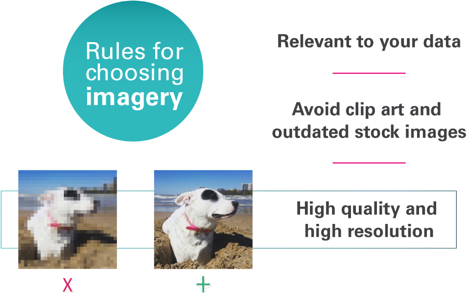
Fig. 4.
Typefaces and fonts
Typeface and font selection are important to the tone of the message being shared (Lupton 2010) and can affect how the reader responds (see Juni and Gross 2008). Typefaces are an expression in themselves and can inject personality into text (see Saltz 2009) (Fig. 5). Essentially, typefaces are analogous to an outfit being worn by the presentation; thus, the outfit choice should appropriately reflect the occasion. Using a typeface like Comic Sans can present text and data as playful and not serious. A clichéd display typeface like Papyrus can give off an organic, earthy, new-age feeling that would be better suited to a vacation resort than science communication material. It can be intimidating to know where to start when there are thousands of typeface and fonts to choose from.
Fig. 5.
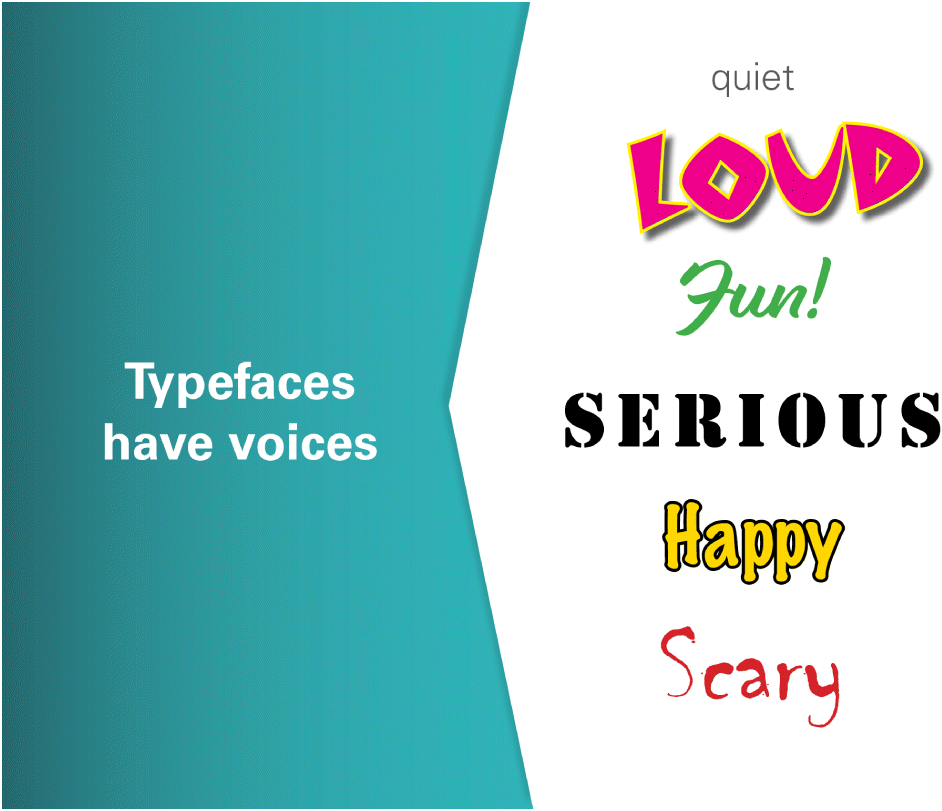
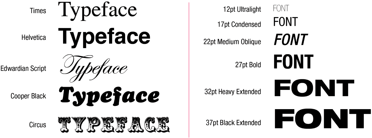
Understanding the difference between typeface and font is important, though the terms are often incorrectly interchanged (see Lupton 2010). A typeface is the appearance, or face of the letterform; this is the visual design of the type. Examples include Helvetica, Times New Roman, Edwardian Script, and Banco. A font is the sizes and weights available for a typeface. Figure 6 shows the typeface Helvetica in several available fonts in the Helvetica font family. The terms typeface and font are not interchangeable, but both can accomplish the same result. A heavy, bold font such as Helvetica 93 Extra Heavy Black 30 pt can express a word “loudly”. A wildly styled typeface such as Banco can “say” the same thing, without the need for any font weights.
Fig. 6.
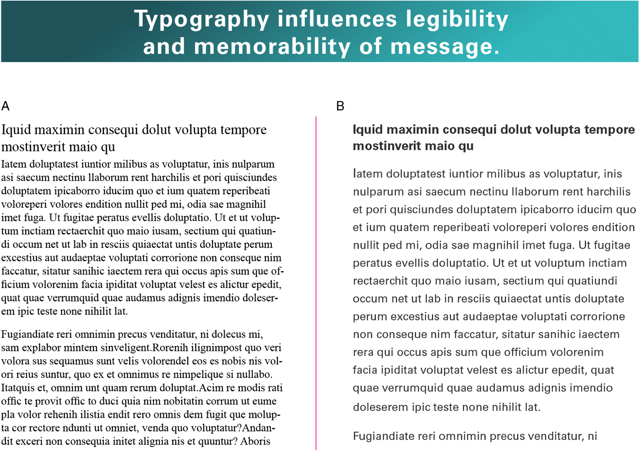
Legibility is an important consideration in any communication and can be influenced by the choice of the font as well as the font size. A great example is the research done to improve the legibility of highway guide signs by evaluating the effect of font and case use (Garvey et al. 1997). Use of typefaces with serifs (a decorative stroke extending from the letter) or those without (hence, sans serif) can be affected by size, contrast, and spacing of the characters (Lidwell et al. 2010) (e.g., Fig. 7). Once you have created your visual presentation, take a critical look at it and determine if it is legible from where your audience will be when viewing it, and adjust from there. As accessibility of information is important for inclusivity of diverse audiences, research continues into best typefaces for legibility and readability for those with low vision (see Russell-Minda et al. 2007) and dyslexia (Rello and Baeza-Yates 2013).
Fig. 7.
Lastly, the memorability of the message can also be influenced by typeface and font choice in how they are used to guide the reader through your information. This is accomplished by creating a hierarchy of information in your presentation. For example, you can use display typefaces (e.g., Algerian, Cooper, Stencil) for headlines or titles to distinguish these sections from the rest of the body text. Display typefaces work well in these scenarios but are not meant for body copy, as they are difficult to read in text. Deciding which typefaces to combine in a presentation may require some experimentation, but aim for contrast in scale and weight (Lupton 2010).
Colour
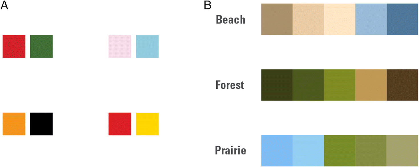
Colour is a communication tool (Fig. 8). In nature, bright or contrasting colour patterns can provide warning cues as antipredator adaptation (Darst et al. 2006). In human culture, we associate colours with symbols and signs (e.g., red can symbolize love and cue a person to “stop”) (Caivano 1998; Lupton 2017). That said, colour connotations can also vary among cultures (Lupton and Phillips 2008; Ou et al. 2012), highlighting the importance of knowing the target audience and how all design choices could play into message perception. Colour combinations could invoke thoughts of holidays, sports teams, or fast-food establishments, all of which could trigger emotions or distract the audience from the message of the science communication (Fig. 9A).
Fig. 8.
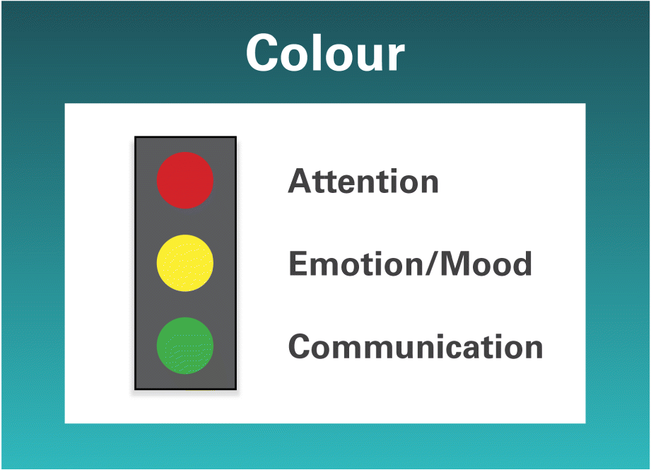
Fig. 9.
Aside from drawing attention to the presentation, colour can be used to create hierarchies in the data (i.e., using colour as an organizational tool similar to using display typefaces as discussed above). To assist with the memorability of the message, you may choose to highlight a phrase in your text a different colour, harnessing the Von Restorff effect where noticeably different text will be recalled more easily than common text (Lidwell et al. 2010). However, exercise restraint in using too many colours. If everything is distinctly different, then nothing stands out.
Beyond choosing complementary or analogous colour schemes (Lupton and Phillips 2008), colour palettes could be inspired by nature (Fig. 9B). Be cognizant however that some colour schemes do not work well for colour-deficient viewers (Light and Bartlein 2004) and are not always printer or photocopier friendly. Resources like ColorBrewer2.org (Brewer 2018) allow you to explore colour options for sequential, diverging, and qualitative data, and it provides a user-friendly interface for scientists.
When to do-it-yourself or consult a graphic designer
Many academic labs, networks of scientists, and nongovernmental organizations are creating brand identities (i.e., logos) to identify and distinguish their collective work from other scientists. Because branding is ideally a one-time process that can have an impact on audience recall and perception (see Doyle and Bottomley 2004; Grohmann et al. 2013) we suggest utilizing the knowledge and experience of a graphic designer for this exercise. Since logos tend to be used on many visual presentation types (i.e., websites, posters, slides) as well as on clothing worn by the scientists, there are even more considerations for the utility of the design (e.g., scalability).
If cohesion in visual presentations is important to you, consulting a graphic designer in the creation of a style guide and presentation templates that can be self-modified by authors may be advisable. Balancing time, knowledge of design trends, and importance of the impact of the presentation may influence your decision as to whether you consult a graphic designer or do-it-yourself. If you seek science communication funds from grants (see Cooke et al. 2017), earmarking part of the budget to professional design advice in advance can facilitate this process.
How to find a graphic designer and what to expect in the creative process
Finding the right graphic designer is an important factor in the success of your collaboration. Graphic designers can be found through a variety of means. If you have a colleague who has used a graphic designer and you like what they have produced, they may be a good fit for your needs. Researchers based at academic institutions may have a design school available that can take on projects. Credited design classes may even be created to feature projects relevant to your lab for one or two semesters. Utilizing professional organizations like the Graphic Designers of Canada (gdc.design) or the American Institute of Graphic Arts (AIGA.org) allow you to search for designers by location.
Many designers are interested in a diversity of projects that offer new challenges and possibilities. You may find some flexibility in pricing, including graphic designers being willing to offer pro bono services if they are particularly supportive of your science and (or) want to build upon their portfolio. Cons of pro bono arrangements can mean longer process and delivery times due to the designer prioritizing paid work. Project abandonment may result from adverse situations, lack of commitment, or not respecting the designer’s time and expertise. Hiring a paid designer can be costly, although reduced rates are a possibility for the same reasons as pro bono arrangements. Since the work is being paid for, a contract or written agreement should be in place before the project begins. Regardless of the compensation arrangement, there are some general considerations to keep in mind when working with a graphic designer to ensure a successful collaboration (see Box 1). Ultimately good communication between both parties about the objectives and timeline are important, along with a need for trust in the expertise you are enlisting.
Box 1. Tips for working with a graphic designer.
•
Prepare a “design brief” by clearly outlining the objectives and vision you have in mind. Designers cannot create without your vision. If no idea or vision is provided, then the result is entirely up to the designer.
•
Treat pro bono work as a contribution of time, labour, and expertise. It is not “free work”, even if there is no financial compensation.
•
Keep the number of decision-makers to a minimum to prevent “design by committee”.
•
Keep an open mind. Professional graphic designers see trends approximately 4–5 years ahead of the public.
•
If you dislike an idea or design, be sure to explain why. New designs can be uncomfortable at first.
•
See the design as your target audience would see it. Design is not for you, it’s for them.
•
The design examples during the first phase might be a bit rough. This is normal as it is the ideas that are being sketched out, not the design itself.
•
Respect the designer’s time and expertise in their field. If you don’t understand a change or idea, ask.
•
Know when to respectfully end a collaboration if it’s not working out or if for some reason the design isn’t needed any more. Everyone’s time is precious.
Conclusions
This paper serves as a primer in the fundamentals of graphic design principles and provides several excellent resources where interested readers could delve further into topics. By laying a foundation in understanding why design choices are made and bridging a gap in the specialized language used in graphic design; the intent is that those seeking to improve their visual science communications will be able to do so more effectively. We advocate for an increase in inter-disciplinary collaborations between scientists and graphic designers to enhance science communication effectiveness. As Rodriguez Estrada and Davis (2015) eloquently stated “only by seeing the world through its audience’s eyes can science communicators build durable and beneficial audience relationships”. Good design can’t be unseen, but good science may not be seen without good design.
Acknowledgements
We appreciate Ross Cunning and Chris Haak for providing valuable comments on earlier versions of the manuscript. We also thank the reviewers for their time and thoughtful comments that led to the final version of this manuscript.
References
Baram-Tsabari A, and Lewenstein BV. 2013. An instrument for assessing scientists’ written skills in public communication of science. Science Communication, 35(1): 56–85.
Barnard M. 2005. Graphic design as communication. Routledge, London, UK. 213 p.
Bickford D, Posa MRC, Qie L, Campos-Arceiz A, and Kudavidanage EP. 2012. Science communication for biodiversity conservation. Biological Conservation, 151: 74–76.
Brewer CA. 2018. ColorBrewer [online]: Available from ColorBrewer2.org/.
Caivano JL. 1998. Color and semiotics: a two-way street. Color Research and Application, 23(6): 390–401.
Cirino LA, Emberts Z, Joseph PN, Allen PE, Lopatto D, and Miller CW. 2017. Broadening the voice of science: promoting scientific communication in the undergraduate classroom. Ecology and Evolution, 7(23): 10124–10130.
Cook MP. 2006. Visual representations in science education: the influence of prior knowledge and cognitive load theory on instructional design principles. Science Education, 90(6): 1073–1091.
Cooke SJ, Gallagher AJ, Sopinka NM, Nguyen VM, Skubel RA, Hammerschlag N, et al. 2017. Considerations for effective science communication. FACETS, 2: 233–248.
Darst CR, Cummings ME, and Cannatella DC. 2006. A mechanism for diversity in warning signals: conspicuousness versus toxicity in poison frogs. Proceedings of the National Academy of Sciences of the United States of America, 103(15): 5822–5857.
Doyle JR, and Bottomley PA. 2004. Font appropriateness and brand choice. Journal of Business Research, 57: 873–880.
Farinella M. 2018. The potential of comics in science communication. Journal of Science Communication, 17(1): 1–17.
Frankel FC, and DePace AH. 2012. Visual strategies—a practical guide to graphics for scientists and engineers. Yale University Press, New Haven, Connecticut. 153 p.
Garvey PM, Pietrucha MT, and Meeker DT. 1997. Effects of font and capitalization on legibility of guide signs. Transportation Research Record: Journal of the Transportation Research Board, 1605: 73–79.
Grainger S, Mao F, and Buytaert W. 2016. Environmental data visualisation for non-scientific contexts: literature review and design framework. Environmental Modelling and Software, 85: 299–318.
Grohmann B, Giese JL, and Parkman ID. 2013. Using type font characteristics to communicate brand personality of new brands. Journal of Brand Management, 20(5): 389–403.
Guenther L, and Joubert M. 2017. Science communication as a field of research: identifying trends, challenges and gaps by analysing research papers. Journal of Science Communication, 16(2): A02 [online]: Available from jcom.sissa.it/archive/16/02/JCOM_1602_2017_A02.
Illingworth S. 2017. Delivering effective science communication: advice from a professional science communicator. Seminars in Cell and Developmental Biology, 70: 10–16.
Juni S, and Gross JS. 2008. Emotional and persuasive perception of fonts. Perceptual and Motor Skills, 106: 35–42.
Kelleher C, and Wagener T. 2011. Ten guidelines for effective data visualization in scientific publications. Environmental Modelling and Software, 26(6): 822–827.
Kueffer C, and Larson BMH. 2014. Responsible use of language in scientific writing and science communication. BioScience, 64(8): 719–724.
Leborg C. 2006. Visual grammar. Princeton Architectural Press, New York, New York. 95 p.
Lee PS, West JD, and Howe B. 2018. Viziometrics: analyzing visual information in the scientific literature. IEEE Transactions on Big Data, 4(1): 117–129.
Lidwell W, Holden K, and Butler J. 2010. Universal principles of design: 125 ways to enhance usability, influence perception, increase perception, increase appeal, make better design decisions, and teach through design. Rockport Publishers Inc., Beverly, Massachusetts. 272 p.
Light A, and Bartlein PJ. 2004. The end of the rainbow? Color schemes for improved data graphics. EOS, Transactions, American Geophysical Union, 85(40): 385–391.
Lupton E. 2010. Thinking with type: a critical guide for designers, writers, editors, and students. 2nd edition. Princeton Architectural Press, New York, New York. 224 p.
Lupton E. 2017. Design is storytelling. Cooper Hewitt Smithsonian Design Museum, New York, New York. 160 p.
Lupton E, and Phillips JC. 2008. Graphic design: the new basics. Princeton Architectural Press, New York, New York. 247 p.
Maddalena K, and O’Reilly CA. 2018. Dissolving the divide between expert and public—improving the science communication service course. In Scientific communication: principles, practices, and pedagogies. Edited by H Yu and KM Northcut. Routledge, New York, New York. pp. 219–238.
Makri A. 2017. Give the public the tools to trust scientists. Nature, 541: 261.
Mayer RE, and Gallini JK. 1990. When is an illustration worth ten thousand words? Journal of Educational Psychology, 82(4): 715–726.
McInerny GJ, Chen M, Freeman R, Gavaghan D, Meyer M, Rowland F, et al. 2014. Information visualization for science and policy: engaging users and avoiding bias. Trends in Ecology & Evolution, 29(3): 148–157.
Moore P, and Fitz C. 1993. Gestalt theory and instructional design. Journal of Technical Writing and Communication, 23(2): 137–157.
Ou L-C, Luo MR, Sun PL, Hu NC, Chen HS, Guan SS, et al. 2012. A cross-cultural comparison of colour emotion for two-colour combinations. Color Research and Application, 37(1): 23–43.
Ozdamli F, and Ozdal H. 2018. Developing an instructional design for the design of infographics and the evaluation of infographic usage in teaching based on teacher and student opinions. Eurasia Journal of Mathematics, Science and Technology Education, 14(4): 1197–1219.
Pavio A, Rogers TB, and Smythe PC. 1968. Why are pictures easier to recall than words? Psychonomic Science, 11(4): 137–138.
Pedwell RK, Hardy JA, and Rowland SL. 2017. Effective visual design and communication practices for research posters: exemplars based on the theory and practice of multimedia learning and rhetoric. Biochemistry and Molecular Biology Education, 45(3): 249–261.
Rakedzon T, Segev E, Chapnik N, Yosef R, and Baram-Tsabari A. 2017. Automatic jargon identifier for scientists engaging with the public and science communication educators. PLoS ONE, 12(8): e018742.
Rello L, and Baeza-Yates R. 2013. Good fonts for dyslexia. In ASSETS ‘13: Proceedings of the 15th International ACM SIGACCESS Conference on Computers and Accessibility, Bellevue, Washington, October 2013. Association for Computing Machinery (ACM), New York, New York. pp. 1–8.
Rickard LN, Schuldt JP, Eosco GM, Scherer CW, and Daziano RA. 2017. The proof is in the picture: the influence of imagery and experience in perceptions of hurricane messaging. Weather, Climate, and Society, 9(3): 471–485.
Rigutto C. 2017. The landscape of online visual communication of science. Journal of Science Communication, 16(2): C06.
Rodriguez Estrada FC, and Davis LS. 2015. Improving visual communication of science through the incorporation of graphic design theories and practices into science communication. Science Communication, 37(1): 140–148.
Rull V. 2014. The most important application of science. EMBO Reports, 15(9): 919–922.
Russell-Minda E, Jutai JW, Strong JG, Campbell KA, Gold D, Pretty L, et al. 2007. The legibility of typefaces for readers with low vision: a research review. Journal of Visual Impairment and Blindness, 101(7): 402–415.
Saltz I. 2009. Typography essentials—100 design principles for working with type. Rockport Publishers Inc., Beverly, Massachusetts. 208 p.
Treise D, and Weigold MF. 2002. Advancing science communication: a survey of science communicators. Science Communication, 23(3): 310–322.
Tufte ER. 1997. Visual explanations: images and quantities, evidence and narrative. Graphics Press, Cheshire, Connecticut.
Tversky B. 2011. Visualizing thought. Topics in Cognitive Science, 3(3): 499–535.
Ynnerman A, Löwgren J, and Tibell L. 2018. Exploranation: a new science communication paradigm. IEEE Computer Graphics and Applications, 38(3): 13–20.
Information & Authors
Information
Published In
FACETS
Volume 5 • Number 1 • January 2020
Pages: 409 - 422
Editor: Marie-Claire Shanahan
History
Received: 5 December 2018
Accepted: 24 March 2020
Version of record online: 11 June 2020
Copyright
© 2020 Murchie and Diomede. This work is licensed under a Creative Commons Attribution 4.0 International License (CC BY 4.0), which permits unrestricted use, distribution, and reproduction in any medium, provided the original author(s) and source are credited.
Data Availability Statement
All relevant data are within the paper.
Key Words
Sections
Subjects
Authors
Author Contributions
All conceived and designed the study.
All drafted or revised the manuscript.
Competing Interests
The authors have declared that no competing interests exist.
Metrics & Citations
Metrics
Other Metrics
Citations
Cite As
Karen J. Murchie and Dylan Diomede. 2020. Fundamentals of graphic design—essential tools for effective visual science communication. FACETS.
5(1): 409-422. https://doi.org/10.1139/facets-2018-0049
Export Citations
If you have the appropriate software installed, you can download article citation data to the citation manager of your choice. Simply select your manager software from the list below and click Download.
Cited by
1. Implementing and Evaluating a Font Recommendation System Through Emotion-Based Content-Font Mapping
2. Science for social licence to arrest an ecosystem-transforming invasion
3. Cascading effects of climate change on recreational marine flats fishes and fisheries
4. Certification of Vegan and Vegetarian Products: V-Label’s Redesign
5. Methodological guide for the creation of educational materials based on patterns of needs and design
6. How to design an art-science program? Self-reported benefits for artists and scientists in the VI4 artist-in-residence program
7. Implementation of an Online Poster Symposium for a Large-Enrollment, Natural Science, General Education, Asynchronous Course
8. Application Research of Graphic Design Based on Information Resource-Sharing and Big Data Technology
9. Teaching Mode Design and Effect Evaluation Method of Visual Communication Design Course from the Perspective of Big Data
10. Scientific Institutions Should Support Inclusive Engagement: Reflections on the AAAS Center for Public Engagement Approach
11. Combining indicators for better decisions – Algorithms vs experts on lakes ecological status assessment
12. Visual communication in research: a third space between science and art
13. COVID ISSUE: Visual Narratives About COVID-19 Improve Message Accessibility, Self-Efficacy, and Health Precautions
14. Intentional Diagram Design: Using Gestalt Perceptual Grouping in Cladograms to Tackle Misconceptions